Alchemy.
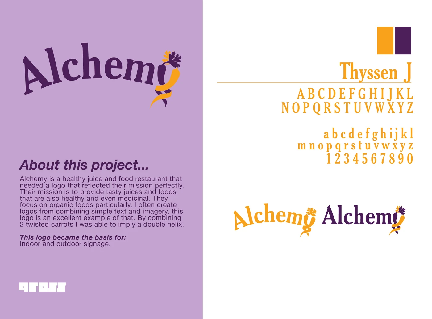
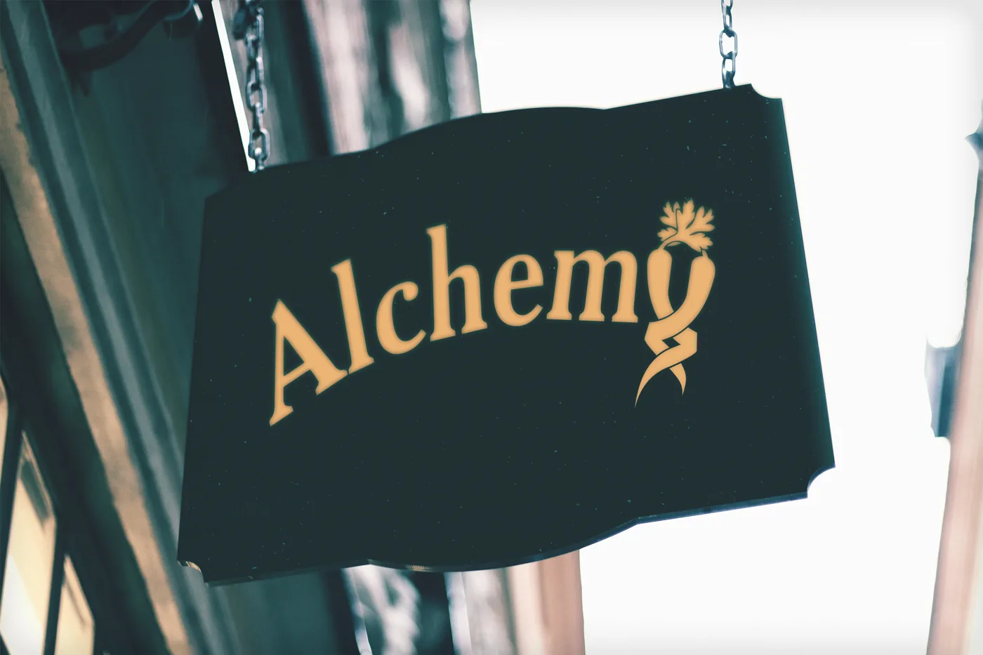
An organic detail within the lettering.
The assignment
Develop a distinctive visual identity and explore how the wordmark could function in different settings and at different scales.
Design decisions
Intertwined carrots form the terminal letter. The organic detail gives the wordmark a recognizable feature, with purple and orange carrying the idea into the application studies.
What was delivered
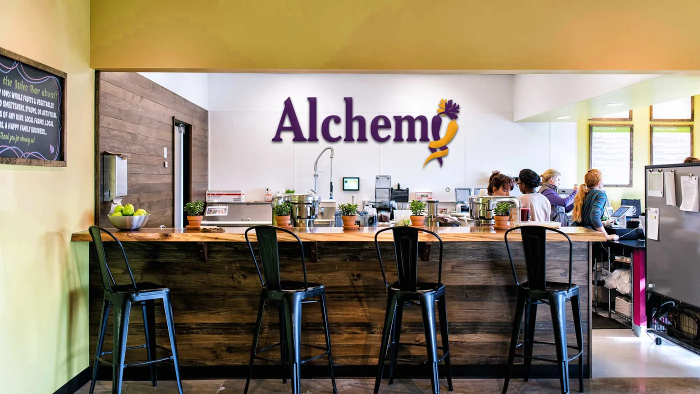
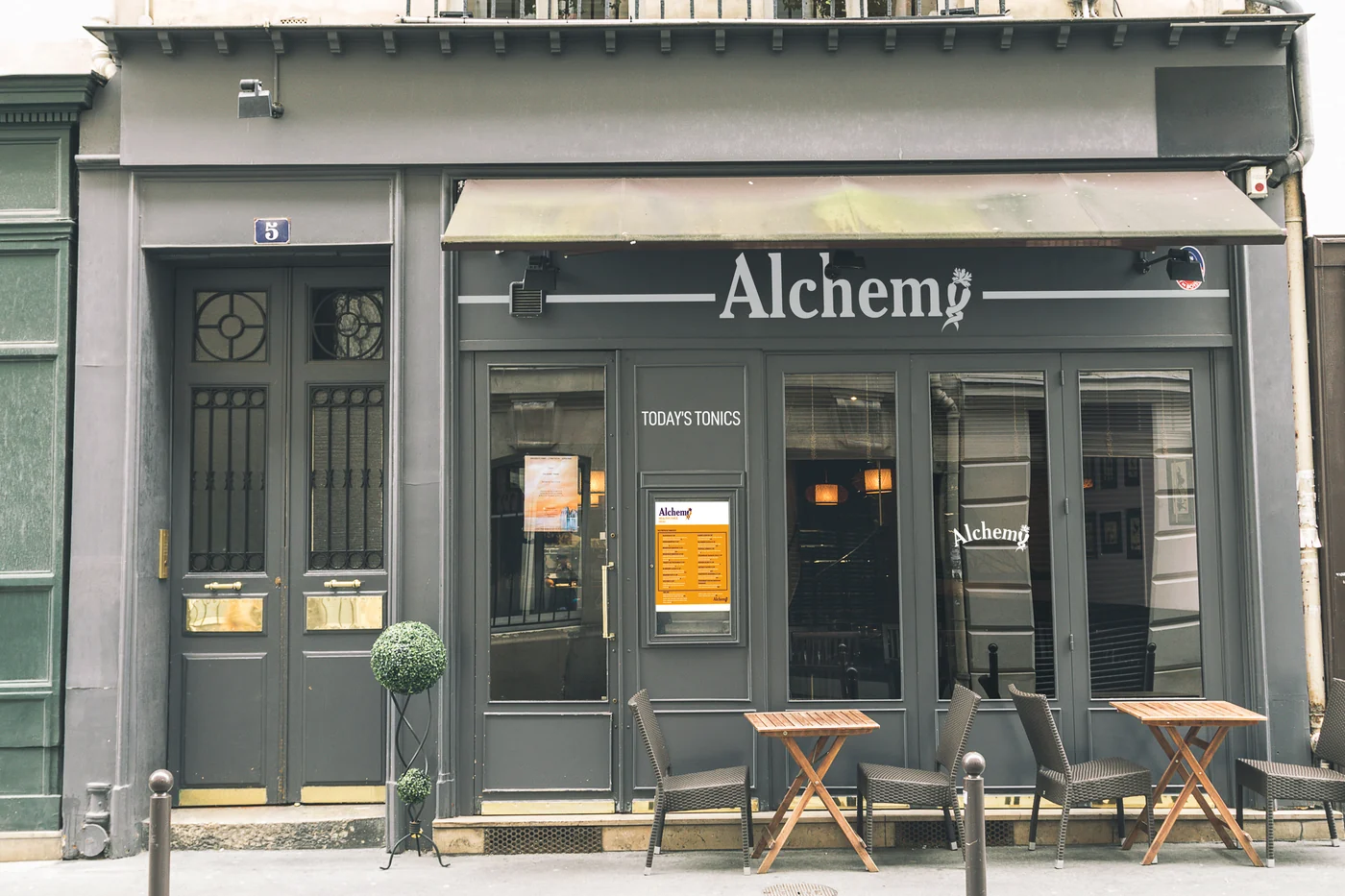
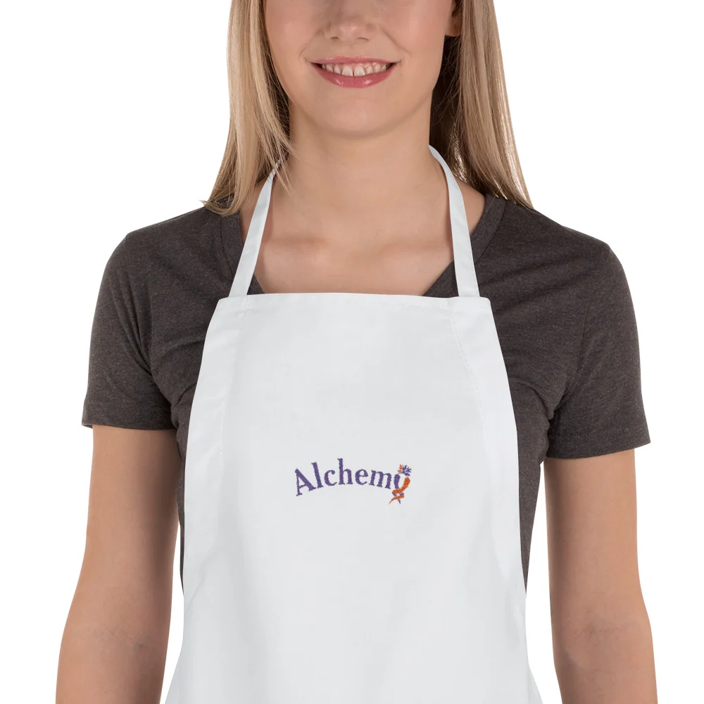
Wordmark and color treatments, plus original storefront, interior, and apron mockups. These images demonstrate the design in context; they do not document a commercial rollout.