Passport to Better.
A campaign language that travels across formats.
The assignment
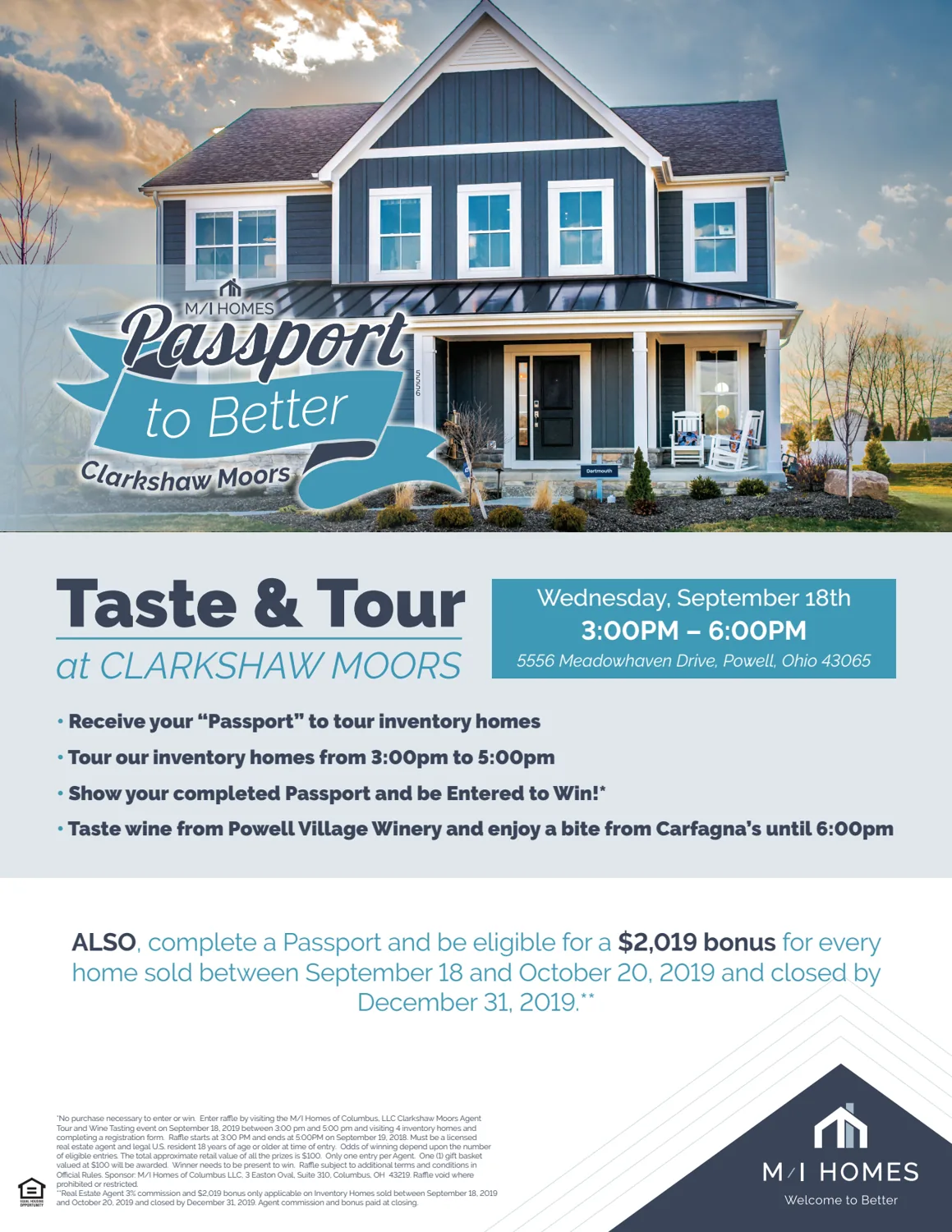
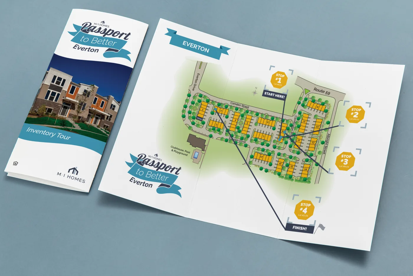
Help translate a shared campaign identity into materials with different purposes: introducing an event, guiding a property tour, and carrying location-specific details.
Design decisions
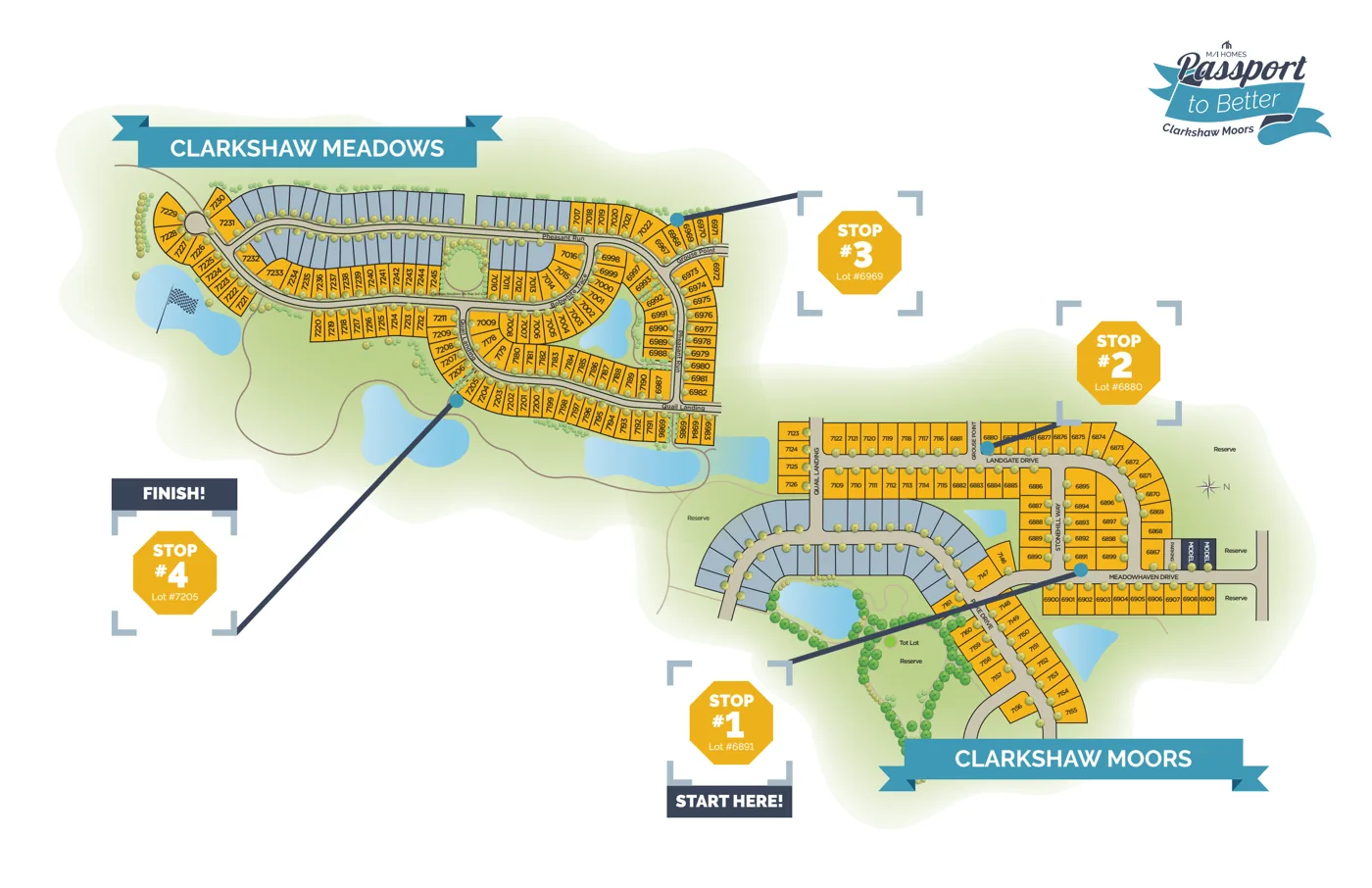
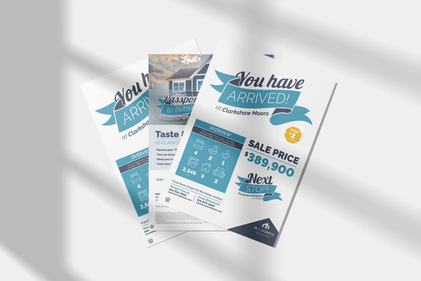
Ribbon forms, the campaign wordmark, and a teal-and-navy palette establish a recognizable family. Layout and hierarchy change with the task: the flyer foregrounds event information, the member card stays compact, and the map prioritizes navigation.
What was delivered
A coordinated set of campaign materials. The lead brochure is the Everton version; supporting pieces are for Clarkshaw Moors. These are distinct applications of a shared campaign, not one combined event.